31 August 2026
If I Can’t See It Jump, What’s the Point?
The surprisingly common design problem of combining a jumping hour with a minute hand.
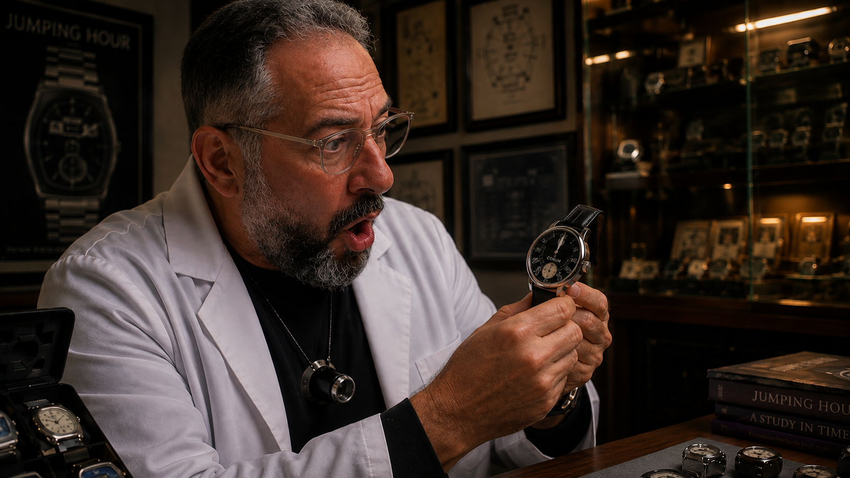
I collect jumping-hour watches for a very simple reason: I like seeing the hour jump. That sounds obvious. But spend enough time looking at jumping-hour watches and you begin to notice a surprisingly common design problem.
The hour is displayed through an aperture, often at 12 o'clock. The minutes are displayed with a conventional central hand. And precisely when the interesting thing is supposed to happen, when the minute hand reaches 60 and the hour changes instantaneously, where is that hand? Directly over the jumping-hour window.
You've designed an entire mechanical complication around something that happens once every sixty minutes. I've waited an hour to watch it happen. And then you've put a hand in front of it. Why? The jump is the show!
A jumping hour replaces the conventional hour hand with a numeral, usually carried on a rotating disc. At the change of the hour, instead of progressing gradually, the indication jumps instantaneously to the next numeral. If all I wanted was an efficient way to know the time, conventional hands would do the job perfectly well.
Part of the attraction of a jumping hour is the mechanical event itself. At 10:59:59 there is a 10 in the window. A second later, it is gone and 11 has taken its place. That's the moment I want to see.
There are hundreds of mechanical digital watches that avoid this issue completely by displaying both hours and minutes on discs. They aren't relevant to this discussion because there is no conflict to solve. The interesting design problem begins when you decide that you want both a jumping-hour aperture and a minute hand. What do you do with that hand when it reaches 60?
Some very important watchmakers seem to have decided that covering the aperture was perfectly acceptable. I disagree.
Audemars Piguet: Really?
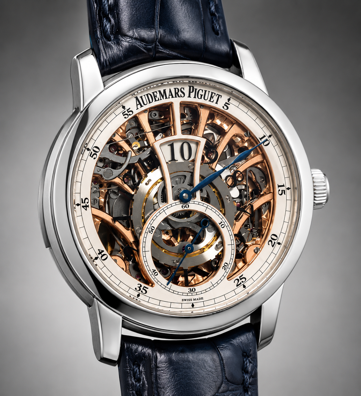
In 2009, Audemars Piguet introduced the Jules Audemars Répétition Minutes Heure Sautante, combining a jumping-hour indication with the vastly more complicated minute repeater. This was serious haute horlogerie with an enormous price attached to it. Yet look at the basic time display.
The jumping-hour aperture is at 12. The minutes are indicated by a conventional central hand. At exactly the moment the hour jumps, the minute hand reaches 12 and passes directly over it. Obviously, the extraordinary price of this watch reflected the minute repeater, movement construction, finishing and extremely limited production rather than merely the jumping-hour mechanism. Still, it's difficult to resist the question.
You can make a minute repeater. You can make a jumping hour. You can make a watch costing close to half a million dollars. But you couldn't find a way for me to see the hour jump unobstructed? Really, AP?
Patek Philippe did it twice
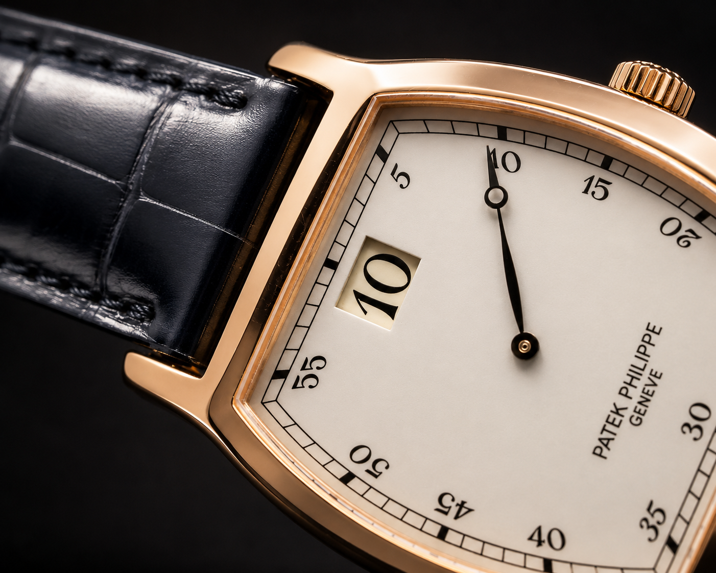
Patek Philippe provides an even more interesting example because essentially the same arrangement appeared generations apart. In 1927, Patek Philippe produced an important jumping-hour wristwatch with a tonneau-shaped case, an hour aperture at 12 and conventional central minutes. Then, in 1989, for the company's 150th anniversary, Patek returned to the design with Reference 3969. The 3969 deliberately echoed the earlier watch. Only 500 were produced, 450 in pink gold and 50 in platinum, powered by Patek Philippe's manually wound Calibre 215 HG. The hour aperture is at 12 and a traditional minute hand sweeps around the dial. Consequently, at precisely the moment the numeral changes, the minute hand arrives in front of it. In this case there is an obvious explanation: the 3969 was conceived as a historical tribute, and the layout was part of what Patek was recreating.
Historical fidelity explains the decision. It doesn't make me like it any more.
Breguet: A Solution That Goes Back Much Further
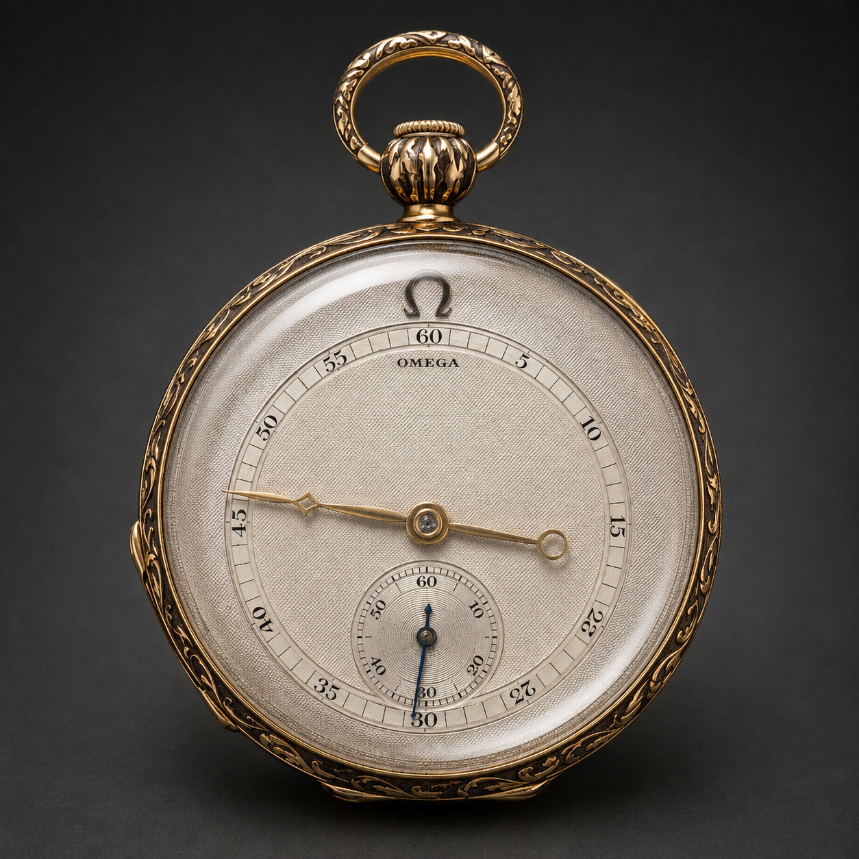
Breguet provides an interesting historical answer to the problem because the basic idea appears much earlier than the modern wristwatch examples in this article.
Look closely at this vintage Breguet jumping-hour pocket watch.
The jumping-hour aperture sits at 12, but the minute scale doesn't extend all the way out to it. Instead, the minutes occupy a smaller circle inside the dial, and the minute hand is correspondingly shorter.
When the hand reaches 60, it points toward the jumping hour but stops well below it.
The two indications have effectively been given separate territories.
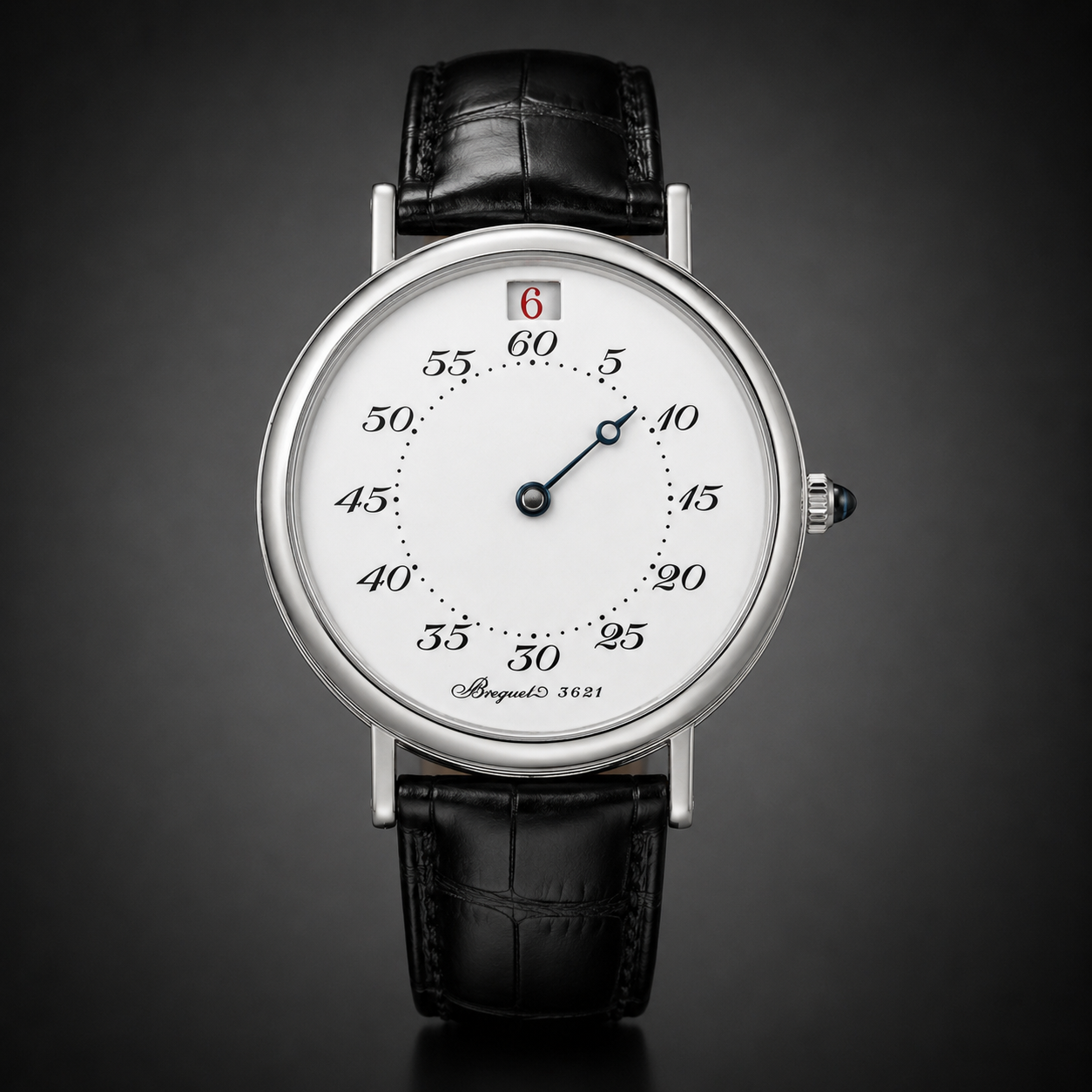
Decades later, Breguet used essentially the same principle on the Ref. 3420 Heures Sautantes. Again, the jumping-hour aperture sits above the minute scale. Again, the minute track occupies a smaller radius. And again, the central minute hand is deliberately short enough that when it reaches 60 it never crosses the hour window. There is nothing complicated about the solution. Breguet simply designed the minute display around the jumping hour rather than placing one on top of the other. And remarkably, the earlier pocket watch shows that this wasn't a new idea.
Rolex: The Same Principle, Taken Further
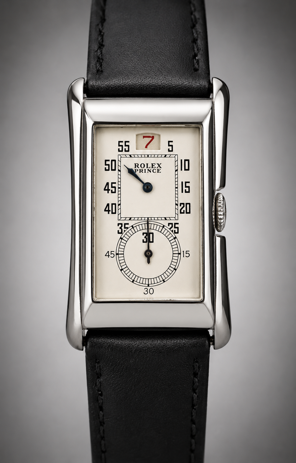
The vintage Rolex Prince Jumping Hour approaches the problem in a similar way, but separates the indications even more clearly. The jumping hour has its own aperture at the top of the dial, while the minutes are moved onto a dedicated subdial below. The implementation is different from Breguet, but the principle is much the same: Give the jumping hour its own space.
Breguet achieves that by reducing the radius of the minute display and shortening the hand. Rolex achieves it by moving the minute indication into a separate register. Neither requires transparency, an opening in the hand or any other trick to reveal the jump. The minute hand simply never gets there.
Doxa also knew what to do
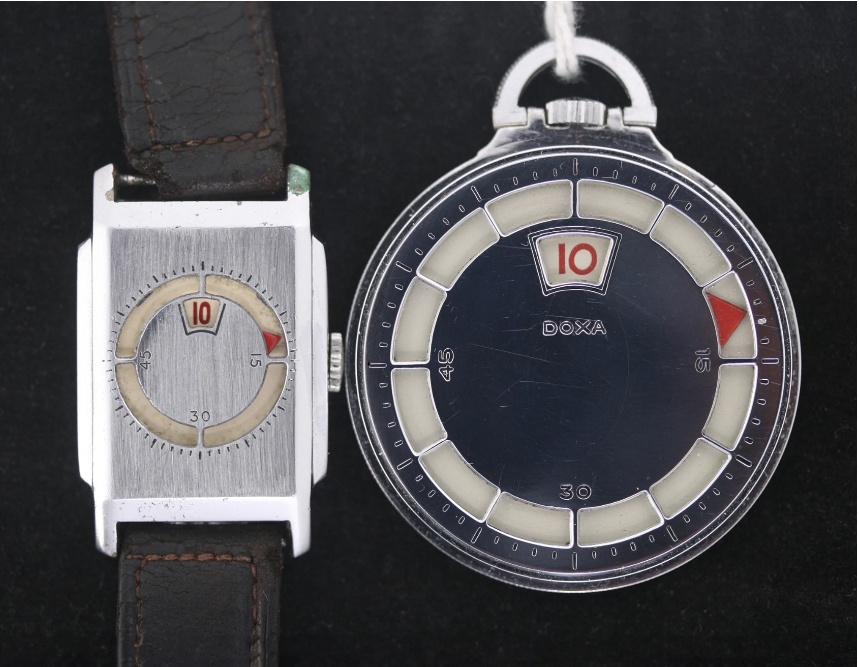
(Photo taken from SwissWatches Magazine)
Collector’s Choice: @jumphourking Ruud van Rijn Talks Jump Hour Watches
Some oe watchmakers recognized the problem
This is where the subject becomes more interesting. Other manufacturers clearly noticed that the minute hand and jumping-hour aperture were competing for the same piece of dial at exactly the wrong moment.
They tried to solve it, not always in ways that completely convince me.
Christopher Ward: transparent isn't invisible
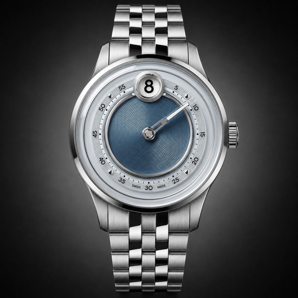
Christopher Ward addressed the obstruction by using transparency in the minute hand. The reasoning is easy to understand. When the minute hand reaches the jumping-hour aperture, the numeral isn't simply hidden behind an opaque piece of metal. You can still see what is happening underneath. It is certainly an improvement.
For me, however, it doesn't completely solve the problem. I've waited sixty minutes for the jump and I'm still viewing it through another component, with the edges and reflections of the hand sitting between my eye and the hour disc. This is obviously a matter of preference. Someone else may consider the problem solved. I don't. Transparent isn't the same as invisible.
MEC-1 takes transparency further
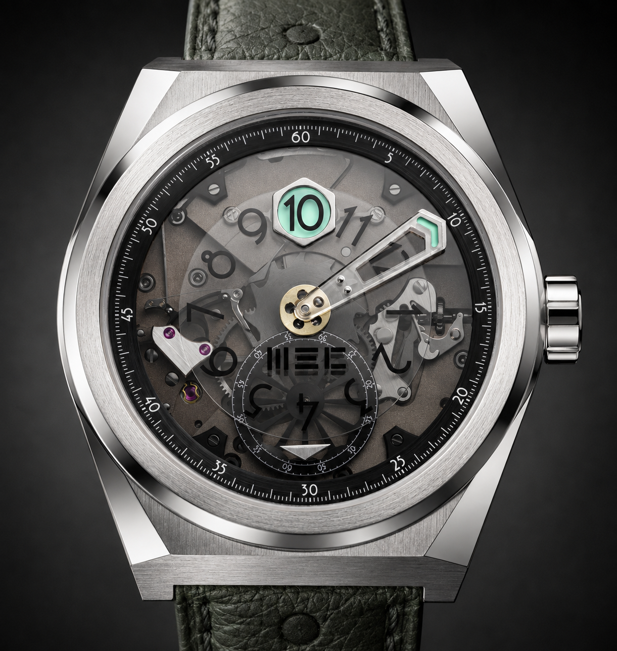
The MEC Watches MEC-1 takes the same basic approach considerably further. Rather than simply opening part of the minute hand, MEC uses a centrally mounted sapphire minute hand. Transparency is also part of the wider architecture of the watch. The MEC-1 uses a smoked sapphire dial that exposes much of the mechanism beneath it.
The watch itself is technically interesting: a manually wound manufacture movement, instantaneous jumping hour and production limited to 50 numbered pieces. It's a coherent solution, and certainly more sophisticated than simply putting an opaque hand over the aperture. But my preference remains the same.
If the jumping hour is the feature I'm waiting to see, I'd rather have nothing between the aperture and my eye when it happens.
Omega turned the problem into the solution
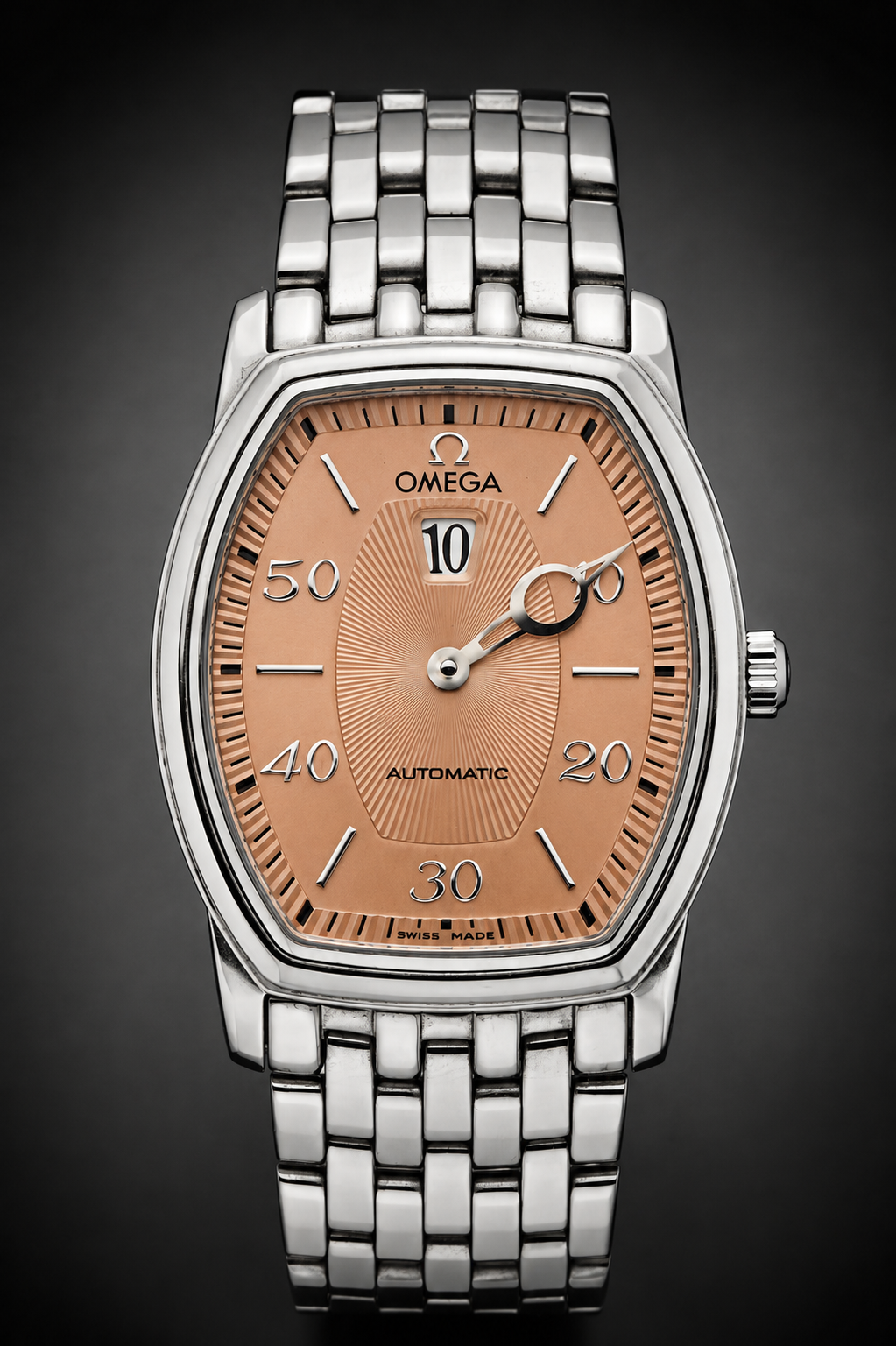
Omega approached the same problem very differently. And this is one of the solutions I like most. Omega kept the conventional central minute hand. The jumping-hour aperture remained at 12. In other words, the geometry that causes the problem was still there. But look at the end of the minute hand. Instead of a solid pointer, there is a large circular opening. As the minute hand reaches 60, that opening arrives at the jumping-hour aperture. Rather than covering the numeral, the hand surrounds it. The minute hand becomes a moving window frame. I find this much more satisfying than making the hand transparent. Omega doesn't try to pretend that the minute hand isn't there. Its arrival at 12 becomes part of the presentation. The circular opening draws your eye directly toward the aperture at the moment the hour changes. The component that would normally cause the problem becomes part of the solution.
Cartier replaced the hand with a disc
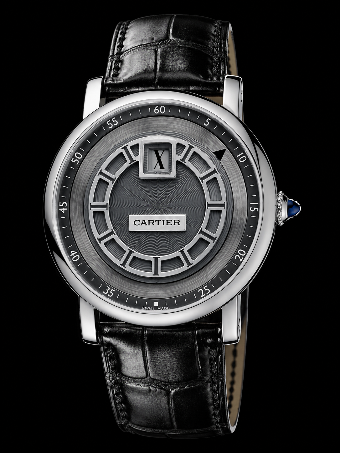
The Rotonde de Cartier Jumping Hour takes another approach that deserves inclusion because, unlike conventional digital-minute watches, it still gives us a moving analogue-style indication of the minutes. But it does so without a conventional hand.
Instead, Cartier uses a rotating minute disc beneath a fixed reading point. The minutes still progress continuously around the dial, but there is no physical hand extending from the center and sweeping across the jumping-hour aperture. This distinction is important. Cartier hasn't simply replaced the minutes with another digital window. It has retained the visual idea of minutes travelling around a dial while eliminating the component that causes the obstruction. The jumping hour remains isolated. I would drop the Roman Numerals if I were you though...
Sartory-Billard made the hand disappear
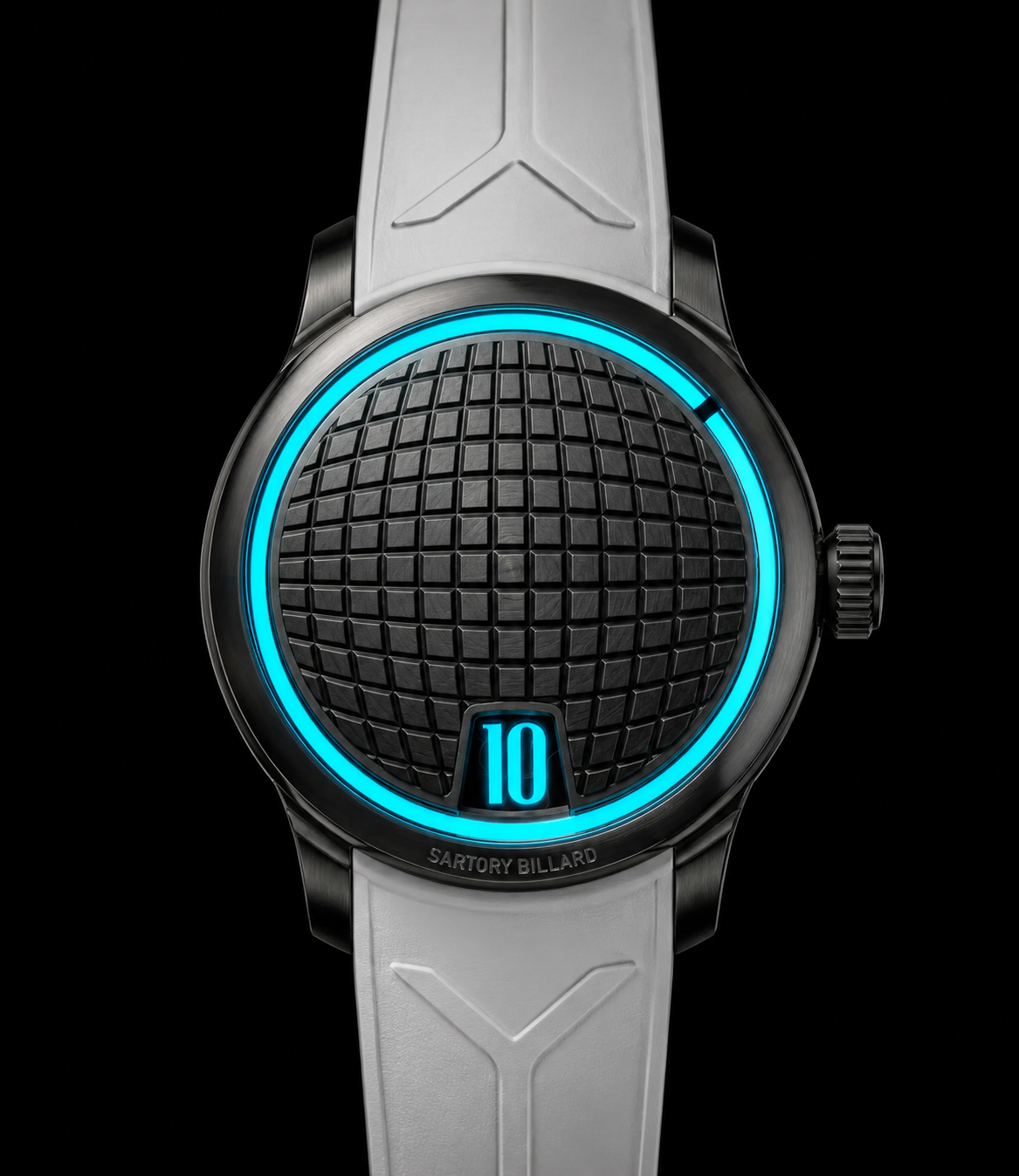
The modern Sartory-Billard SB10 offers another interpretation. Here the indications are carried by ultra-thin sapphire discs rather than conventional hands. One carries the jumping hour, while another rotates continuously to indicate the minutes. The minute indication therefore retains movement around the dial without placing an opaque hand over the hour aperture. Sartory-Billard also enlarged the jumping-hour aperture to improve the visibility of the numeral and its transition. That's a detail I appreciate because it suggests that seeing the jump wasn't treated merely as a consequence of the mechanism. It was considered part of the experience.
My preferred solution: retrograde minutes
There are clearly many ways to deal with this problem. Move the indications apart | Put an opening in the minute hand. | Make the hand transparent. | Replace it with a disc. | Use sapphire. But if I were choosing the solution, I'd take a different approach.
Retrograde minutes.
Not simply because a retrograde minute hand can avoid the jumping-hour aperture. Because it gives me something else to watch. A retrograde minute hand progresses along an arc from zero to sixty. When it reaches the end, it doesn't continue around the dial. It snaps back to zero. Now synchronize that with a jumping hour. At 10:59:59, both mechanisms are waiting. The hour disc jumps from 10 to 11. At virtually the same moment, the minute hand flies from 60 back to zero. Two jumps. At once. Instead of treating the minute hand as something that needs to be kept away from the jumping hour, you've turned it into part of the event.
Gérald Genta made it a signature
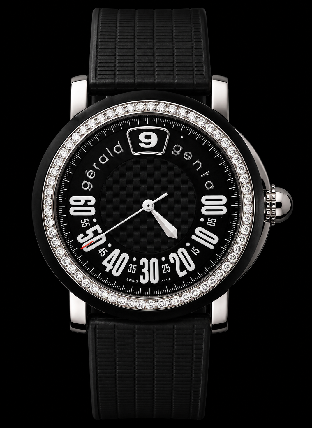
Gérald Genta repeatedly combined jumping hours with retrograde minutes, and the arrangement became one of the recognizable features of watches produced under his own name.
The hour gets a dedicated aperture. The minute hand travels across a large arc. At the end of the hour, the two indications act together.
The Retro Classic used the arrangement in a relatively restrained form. The Retro Sport (as seen in the image) applied the same principle in a much more contemporary case.
There were also the well-known Disney character watches, where a character's arm serves as the retrograde minute hand.
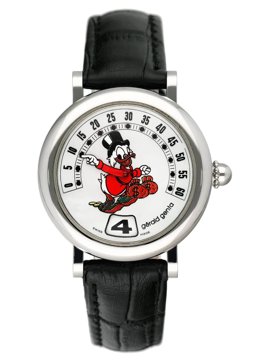
While these aren't personally among my favorite Genta designs (sorry not sorry, Disney) they demonstrate just how central the retrograde mechanism was to his approach.
In those watches the movement of the minute indication becomes very literal: the character's arm progresses across the scale and returns at the change of the hour. Whether the dial is restrained or playful, the underlying idea is the same. The minute indication doesn't interfere with the jumping hour. It participates in the event.
Vacheron Constantin made the same choice
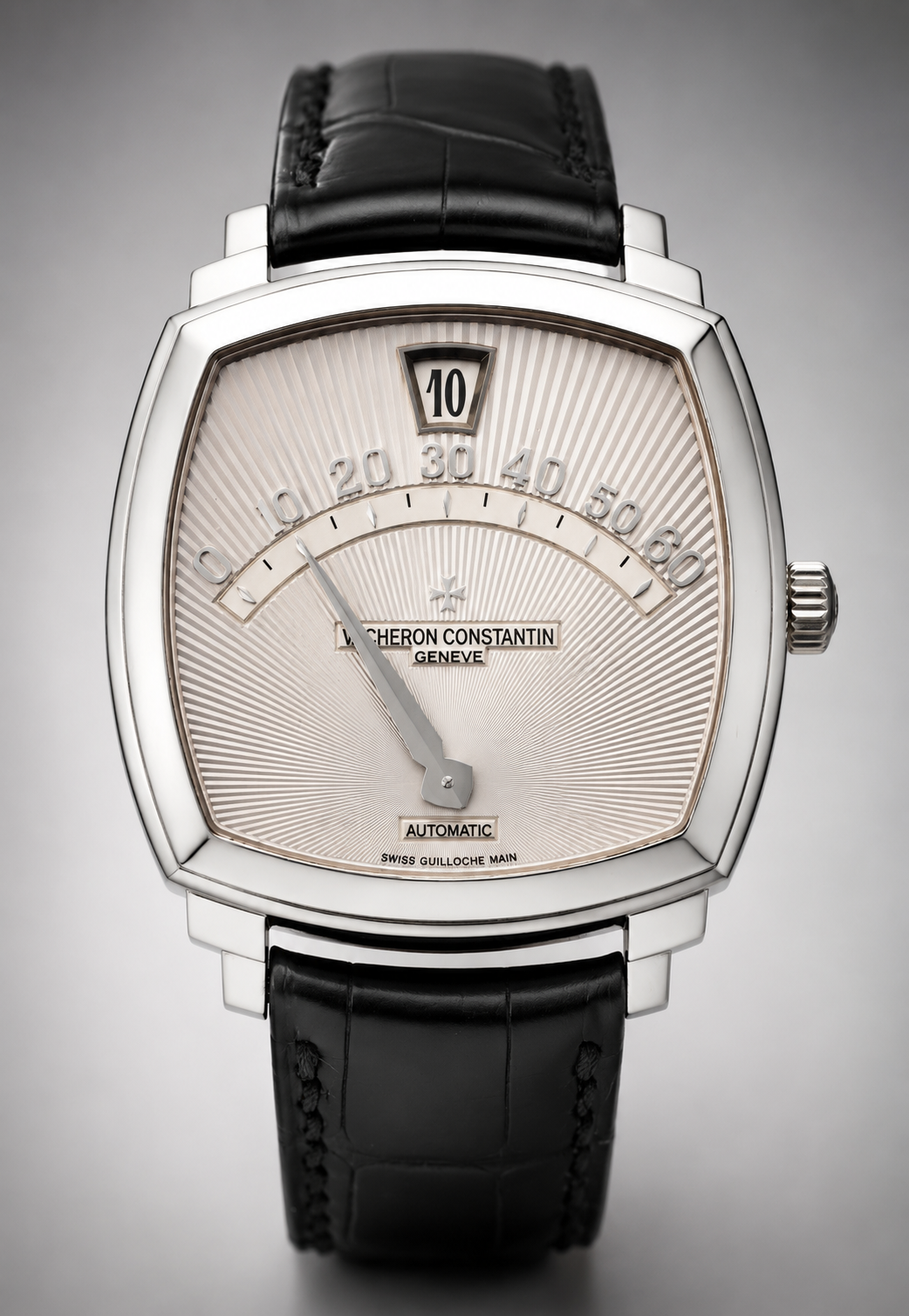
Unlike the two other brands of the Holy Trinity the Vacheron Constantin Saltarello Ref. 43041, introduced in 1997, is another particularly good example. The jumping hour occupies an aperture at 12. Below it, the retrograde minute scale forms a broad arc across the upper half of the dial. The minute hand travels progressively from zero to sixty.
At the top of the hour, the numeral changes and the minute hand returns to zero. The Saltarello was produced in a total of 500 examples across white, pink and yellow gold and used Vacheron Constantin's ultra-thin automatic Calibre 1120/2 with the additional jumping-hour and retrograde mechanism. What matters to this discussion, though, is the display architecture.
Vacheron didn't have to find a way for the minute hand to pass over the jumping-hour aperture without obscuring it. The minute hand never needs to go there. And the return of the retrograde hand gives the wearer a second instantaneous event to watch at precisely the same moment as the jumping hour. For me, that's preferable to merely solving the obstruction. It adds something.
You don't need to be Holy (or Gerald Genta)
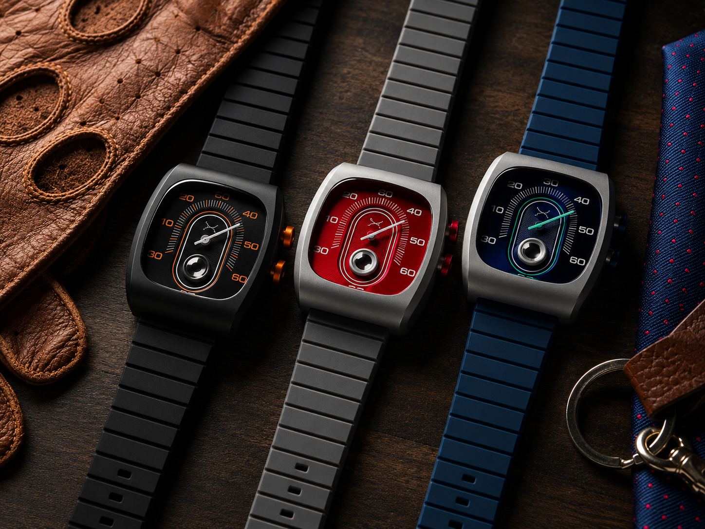
This same principle appears at a very different price level. Xeric has experimented with several unconventional approaches to jumping-hour displays and, importantly, seems consistently aware that the jumping indication should remain visible. Their designs are modern, fun and original (usually), but their watch I took as an example, is the Retroscope, their Quartz affordable wrist watch.
Its Retroscope combines jumping hours with retrograde minutes. The minute hand travels toward the end of its scale. At the change of the hour, it returns to zero while the hour indication advances. The execution and movement are obviously in a completely different category from Vacheron Constantin or Gérald Genta, but the basic design principle is the same.
And that illustrates something important about this entire subject. This isn't fundamentally a question of price. It's a question of thinking about what the wearer is supposed to experience.
So is covering the jump actually bad design?
I guess I'm being a little provocative. Putting a minute hand over a jumping-hour aperture doesn't make a watch badly made. It doesn't make the Patek Philippe 3969 historically unimportant, and it certainly doesn't diminish the technical achievement of an Audemars Piguet minute repeater.
Someone else may own any of those watches and never be bothered by this issue. I am. Because I don't collect jumping-hour watches merely because they're an unusual way of displaying time. I enjoy what happens at the change of the hour.
And once you look at the complication that way, the minute indication creates a surprisingly interesting design question: How do you display the minutes without spoiling the best moment of a jumping-hour watch? Some manufacturers accepted the obstruction.
Christopher Ward and MEC used transparency.
Omega turned the minute hand into a window.
Rolex separated the indications.
Cartier replaced the conventional hand with a rotating disc.
Sartory-Billard used transparent discs.
And Gérald Genta, Vacheron Constantin and others took the approach I prefer. They didn't try to hide the minute hand, they gave it something else to do. Make it jump too.
Because if I've waited sixty minutes for the show, I want a good view.
That's what I am talking about
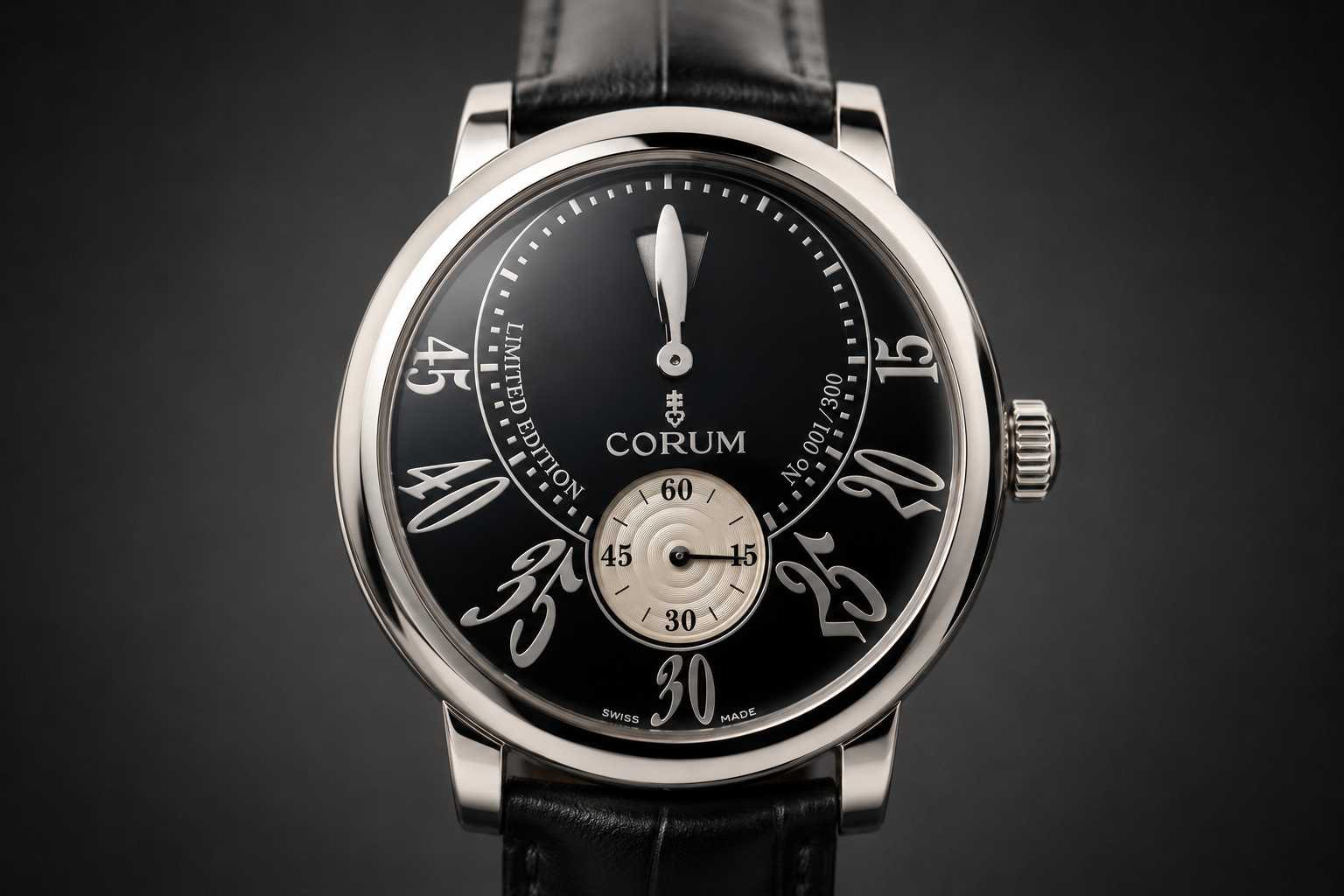
A beautiful watch by Corum, but I can't see it jump
Older comments
 Guy NevoAuthor
Welcome to the discussion. I'd love to hear your thoughts on this piece — share your perspective below.
31 August 2026